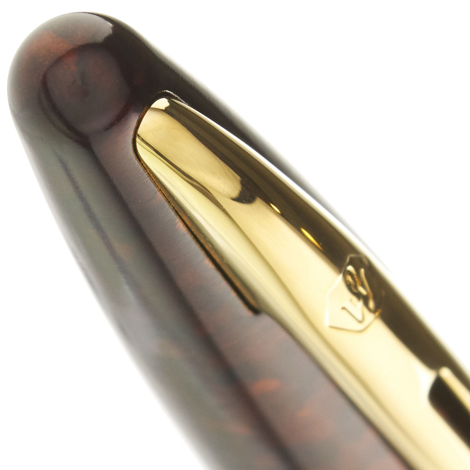
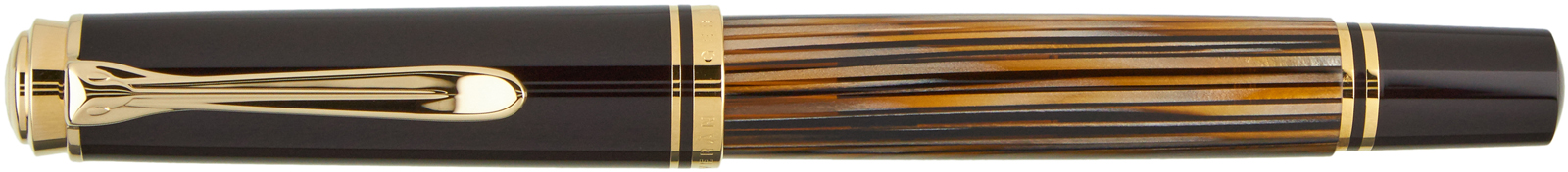
Waterman Carene Marine Amber
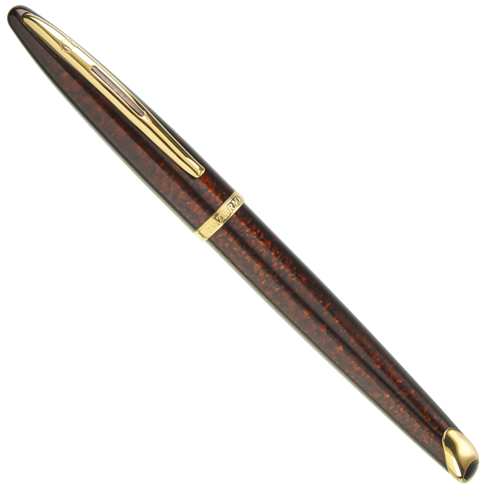

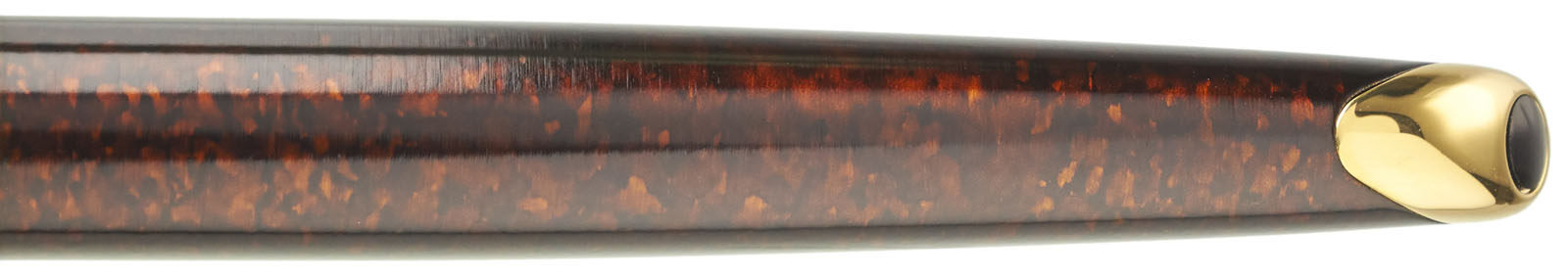


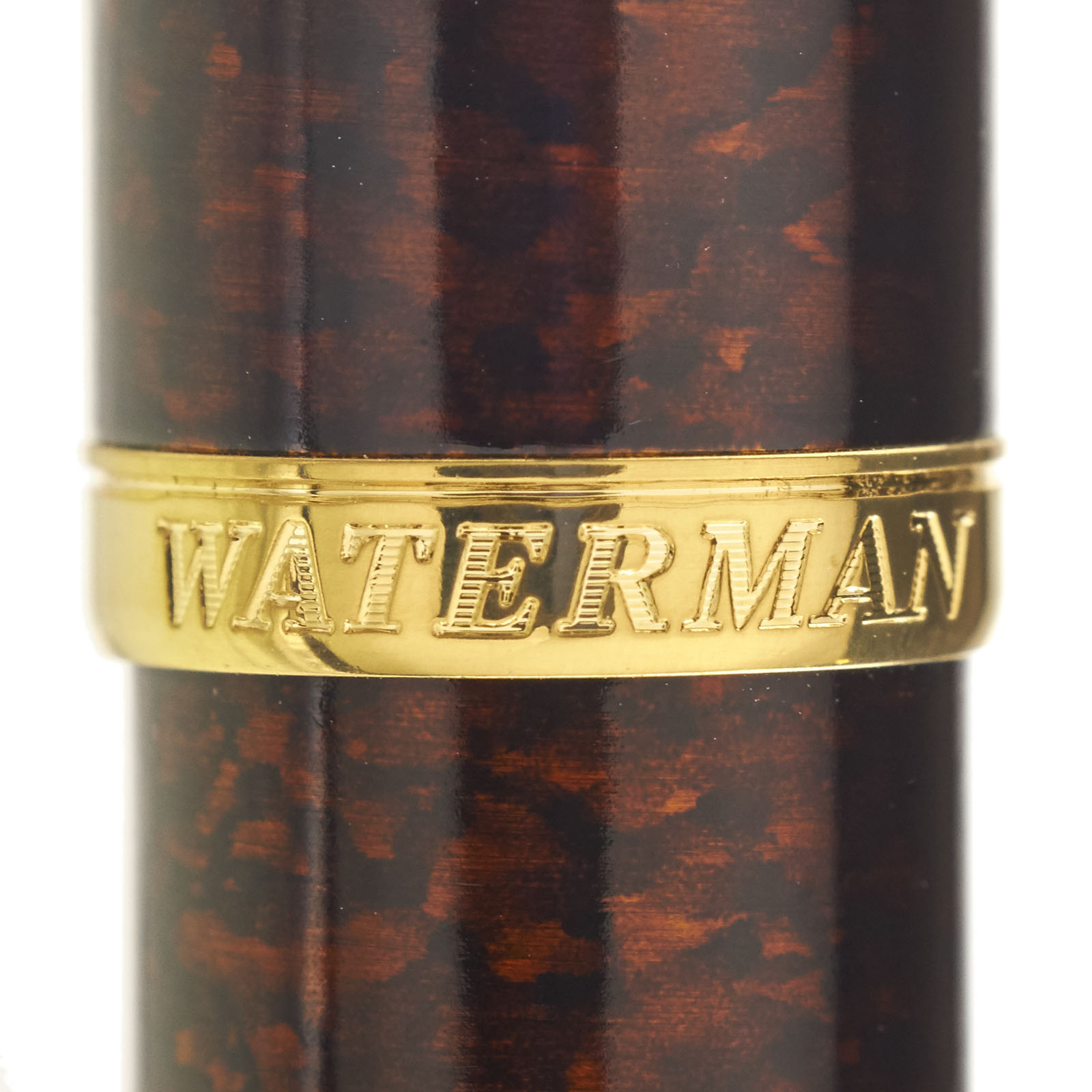

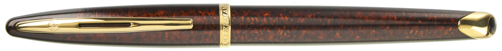


Finished with subtle reddish-brown marbling and trimmed in warm gold, the Waterman Carene Marine Amber fountain pen makes a perfect choice for a business meeting or work event. Amber is often sought out for its natural beauty, and here darker amber tones are replicated with stunning results. Lacquer over brass gives this elegant pen added heft.
Carène means "hull" in French, and the Waterman Carene fountain pen sports an elegantly streamlined design that suggests the sleek lines of a racing yacht. The smooth-writing 18k inlaid nib adds to the appeal of these writing instruments, which also offer excellent value for the price.

In French, "Carene" means to incline to one side, like a ship under sail. Looking at the Carene from a side view, you can see the way its uniquely tapered shape appears to mimic a leaning boat.

The Carene Marine Amber is a mid-size pen that will be a comfortable fit for most users. It can be filled using international size ink cartridges, such as the Pelikan and J. Herbin cartridges we carry, or can be filled with any bottled fountain pen ink using the included converter.


Additional Carene nib units are available for individual sale and are easily interchangeable at home - see our Waterman nibs page for more details.
Each pen is packaged in an attractive Waterman gift box.

Measurements & Specifications
| Closed Length | 5.7" |
| Posted Length | 5.8" |
| Barrel Length | 5" |
| Barrel Diameter | 0.5" |
| Section Diameter | 0.3" |
| Ink Capacity | 1.3 ml |
| Filling System | Cartridge-Converter |
| Cap Type | Snap |
| Clip | With Clip |
| Cartridge Capacity | 1.3 ml |
| Converter Capacity | 0.5 ml |
| Postable | Postable |
| Pen Weight | 33.4 g |

watsonanddad
I ordered this Carene with the factory stub nib. Out of maybe 60-70 pens in my collection, this is my favorite. Even with the stub the writing is incredibly smooth...the flow and wetness are ideal...the look and writing comfort are perfect. The stub: the verticals are heavy and full...the horizontals are crisp and very, very thin....easily 5:1 ratio. The edges: even though the written line is clean, the nib writes with such smoothness you would think it was round. I can’t praise this highly enough. I looked at the Japanese factory stubs but the flow is designed to match the short strokes of writing Kanji. The Carene is designed to keep up with Western Cursive with its long flowing lines. For ne, it’s likely the perfect pen. Gigantic kudos to the staff as well for great service all the through.